

The brand
NEOSPEC supplies equipment, technical products, spare parts and service to automotive workshops, car-care facilities and industrial and MEP projects. Its name joins “Neo”, new and progressive, with “Spec”, standards and precision, and the brand had to carry both ideas.
What we made
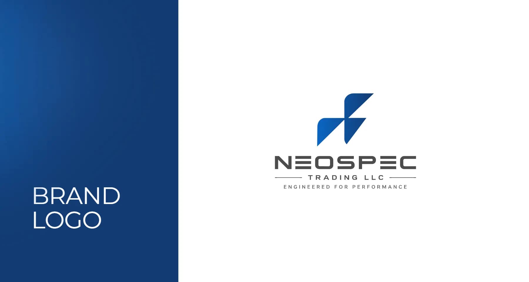
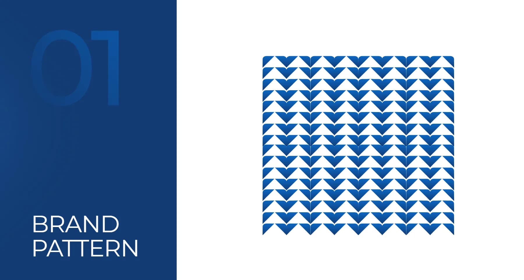
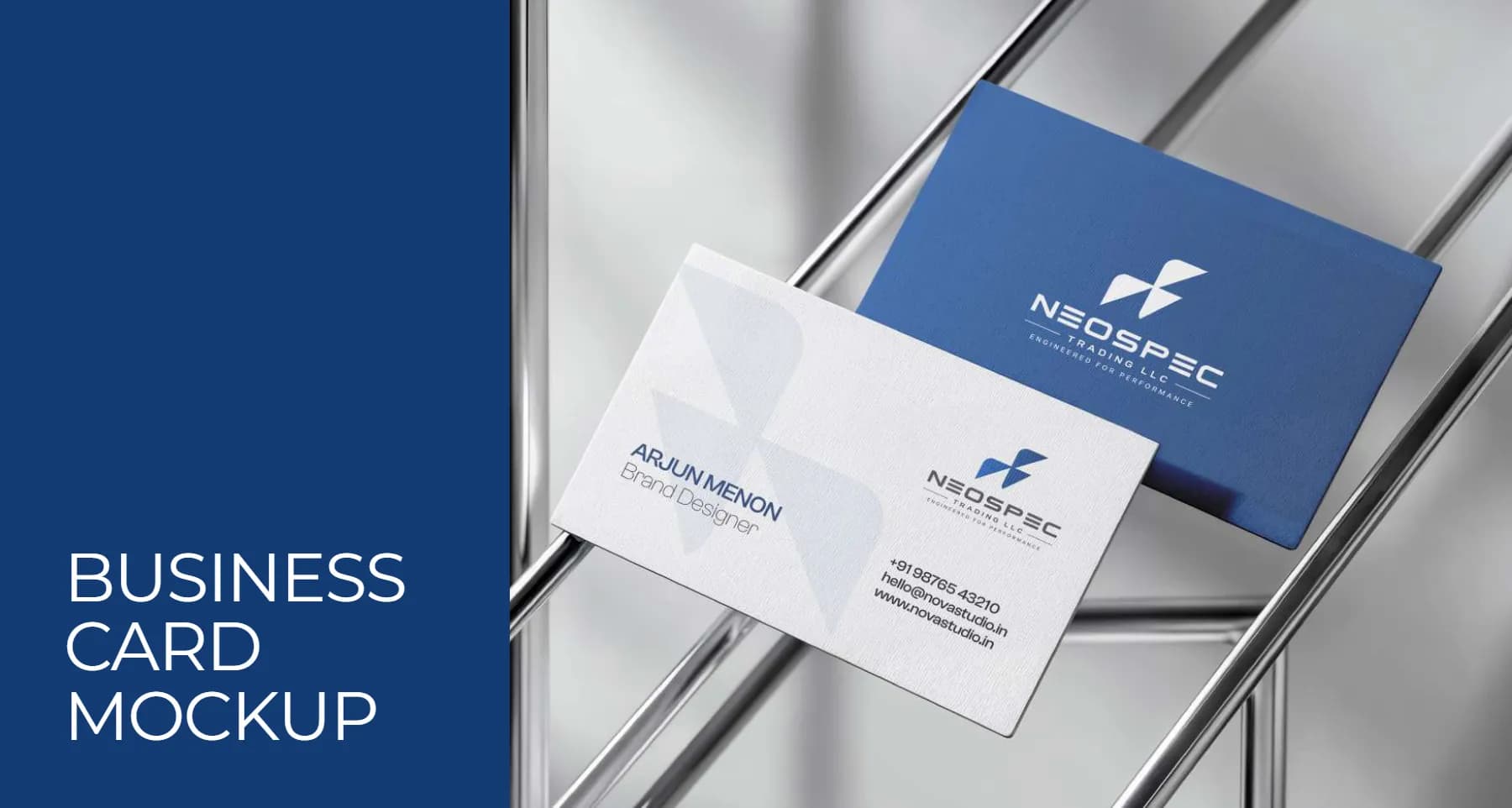
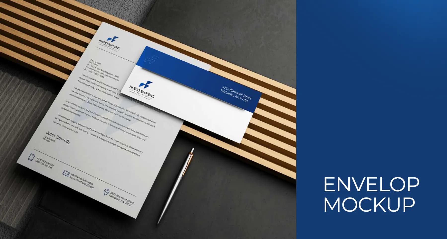
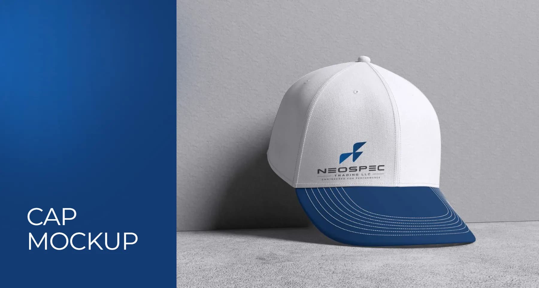
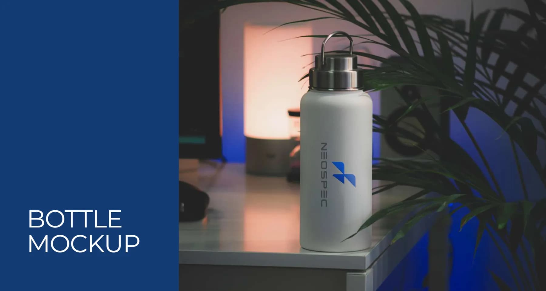
We created a geometric, engineered symbol and a technical wordmark that feel precise, powerful and modern. The guidelines cover the logo and icon in every colour version, the blue palette, two brand fonts, patterns, clear space and minimum sizes, with applications on business cards, envelopes, signage, caps, T-shirts and bottles.
The details
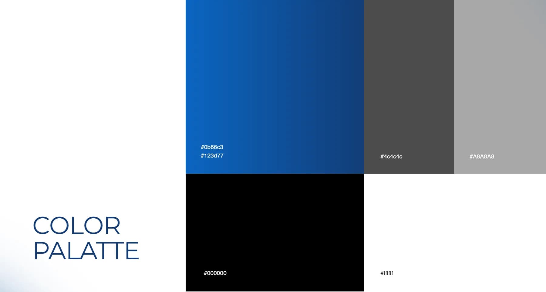
- Blue
#0B66C3 - Deep blue
#123D77 - Dark grey
#4C4C4C - Grey
#A8A8A8
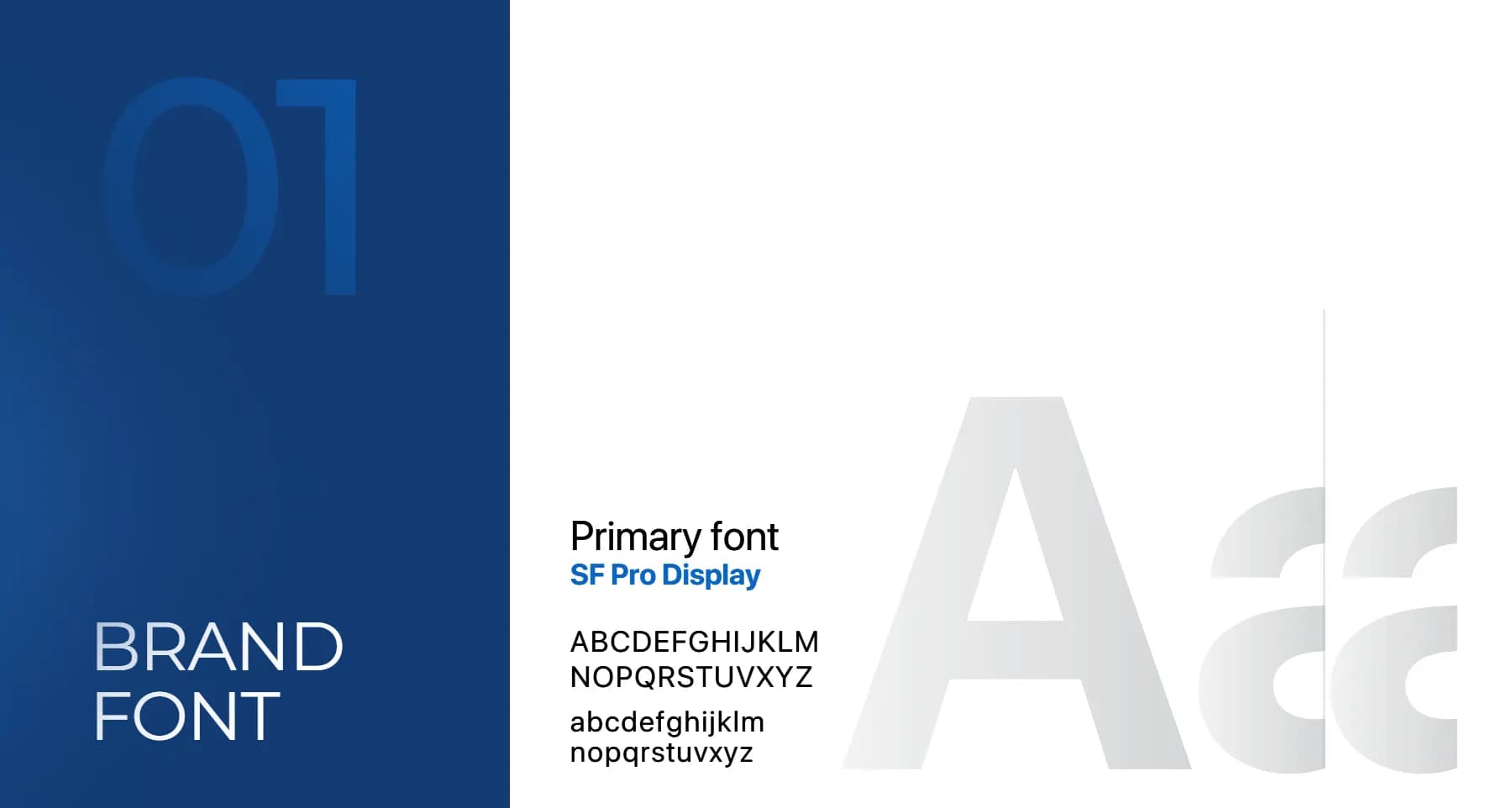
TypefacesSF Pro Display · Montserrat
What we delivered
- Logo and brand mark
- Colour palette
- Typography
- Brand pattern
- Brand guidelines
- Mockups and applications
In the real world

Want resultslike these?
Tell us about your business. We'll show you what we'd do first.